
An interactive prototype for a new navigation that makes finding products faster, cleaner, and a lot less guessy for visitors.
Navigation Redesign
An interactive prototype for a new navigation that makes finding products faster, cleaner, and a lot less guessy for visitors.
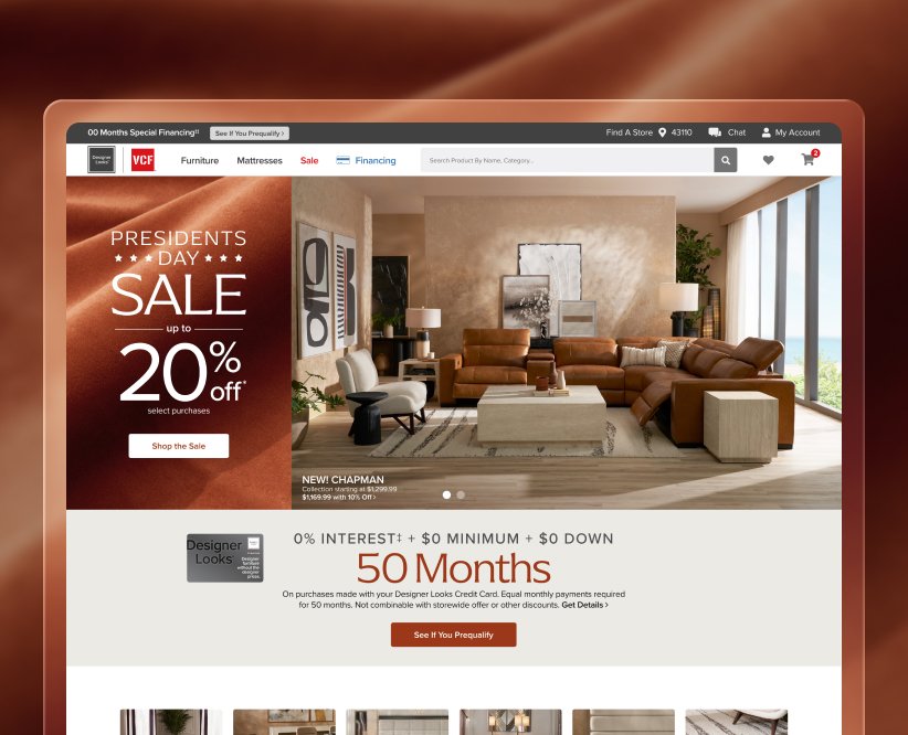
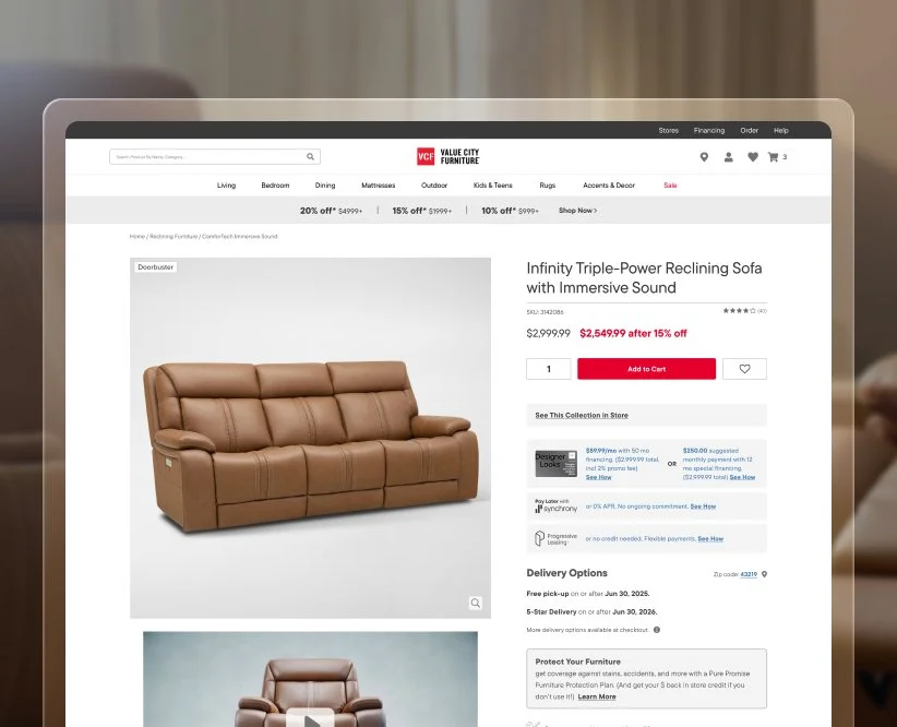
Problem
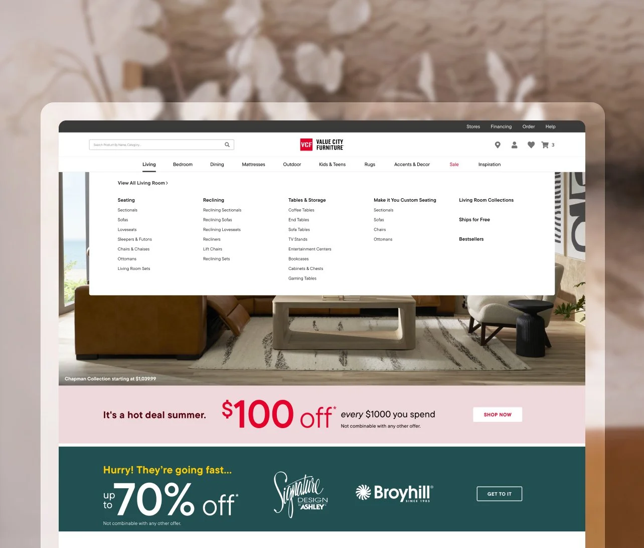
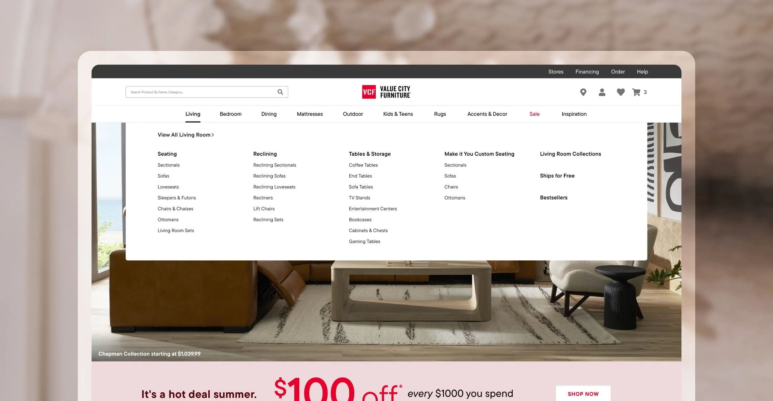
The existing navigation was cluttered and unintuitive, featuring hover-based menus, lengthy category lists, excessive clicks, and overlapping sections that made it difficult for customers to find what they were looking for quickly.
Approach
Redesign the navigation to be cleaner and more intuitive by surfacing and relocating search, replacing rollovers with click-based interactions, and simplifying the category structure. Overlapping content was combined, and items were reordered using click-rate data, then brought to life in an interactive prototype that made product discovery faster, clearer, and easier to use.
Project
Navigation Redesign
Client
American Signature Inc.
Role
Lead UI & UX Designer
Project
Navigation Redesign
Client
American Signature Inc.
Role
Lead UI & UX Designer
Project Overview
Problem
The existing navigation was cluttered and unintuitive, featuring hover-based menus, lengthy category lists, excessive clicks, and overlapping sections that made it difficult for customers to find what they were looking for quickly.
Approach
Redesign the navigation to be cleaner and more intuitive by surfacing and relocating search, replacing rollovers with click-based interactions, and simplifying the category structure. Overlapping content was combined, and items were reordered using click-rate data, then brought to life in an interactive prototype that made product discovery faster, clearer, and easier to use.
Problem
Cluttered, hard-to-scan navigation
Hover-based menus that caused frustration
Long, overwhelming category lists
Redundant subcategories adding confusion
Extra clicks required to reach sub menus
Overlapping sections that confused users
Difficult for customers to quickly find what they were shopping for
Approach
Surfaced and repositioned the search module for quicker access
Exposed main categories upfront to cut down on extra clicks
Shortened dropdown menu height to keep key options above the fold
Replaced hover rollovers with intuitive, click-based interactions
Simplified and streamlined the category structure by removing redundancies
Reordered items using click-rate data
Built an interactive prototype to validate a faster, clearer navigation
Discover More
Brand Refresh Mockup
Product Detail Page
Promotional Campaign
Digital Storytelling
Digital Storytelling
Brand Refresh Mockup
Promotional Campaign
Product Detail Page